Moon design system
Moon is Yolo Group product design system that helps us maintain the integrity of their user experience and optimize design and development resources.
Try out Moon DS for Elixir
Accelerate your development journey with moon components.
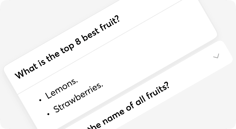
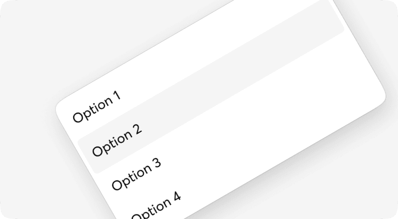
Accordion
An accordion is a vertical stack of interactive headings used to toggle the display of further information; each item can be 'collapsed' with just a short label visible or 'expanded' to show the full content. Based on [Radix UI](https://www.radix-ui.com/).
Alert
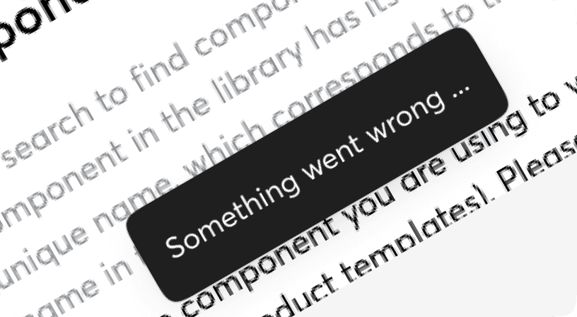
Alert is a way of informing a user of important changes in a prominent way.
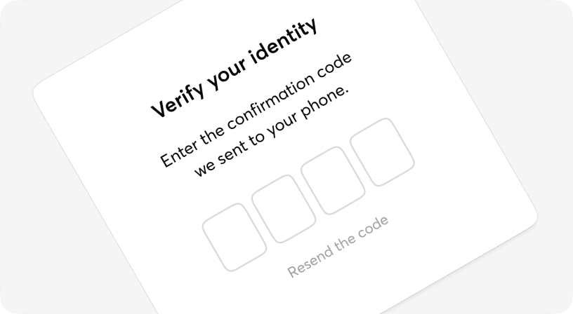
AuthCode
A one-time password (OTP) is an automatically generated numeric or alphanumeric string of characters that authenticates a user for a single transaction or login session. Authcode component is designed for entering OTP codes;it is usually positioned through your UI in places like: - Login - OTP check
Avatar
The Avatar component is typically used to display images, icons, or initials representing people or other entities.

Badge
The Badge component is typically used to display statuses (i.e. online, idle, offline) or numbers representing the count of items in a given list (i.e. List of notifications or unread messages).
BottomSheet
The bottom sheet component is a modified dialog that slides from the bottom of the screen, common pattern in mobile apps. Bottom sheets can contain any anything so let your imagination fly. Based on [Headless UI](https://headlessui.com/).
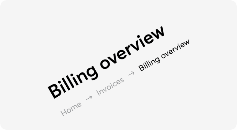
Breadcrumb
A list of links showing the location of the current page in the navigational hierarchy.
Button
Buttons allow users to take actions, and make choices, with a single tap. Buttons communicate actions that users can take. They are typically placed throughout your UI, in places like: - Modal windows - Forms - Cards - Toolbars
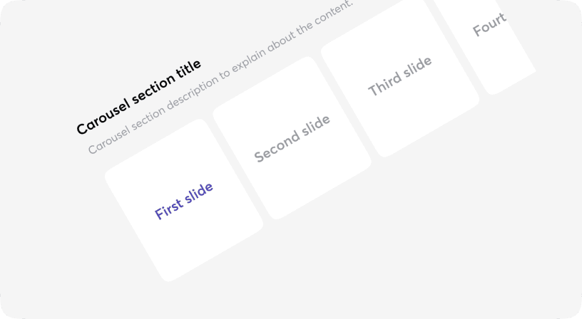
Carousel
This is an effective way of displaying multiple images or content in a single space. Not only does it conserve screen real estate, but it also guides visitors to concentrate on crucial website content, significantly enhancing the overall visual appeal. To support Arabic languages this component requires setting up the `isRtl` prop directly.
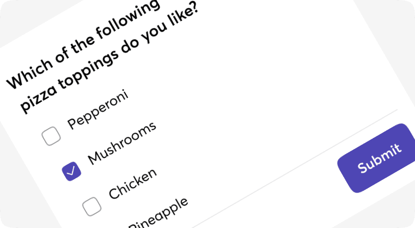
Checkbox
The checkbox is shown as a square box that is ticked (checked) when activated. Checkboxes are used to let a user select one or more options of a limited number of choices.
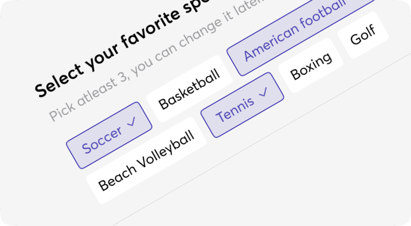
Chip
Chip component is typically used to filter or trigger actions in clickable format. For example, in a UI, you might use a `<Chip />` component for: - Represent a selected filter category among a list - Tag associated with an item The characteristics of a `<Chip />` component are its small size, simplicity and ability to perform actions on a click
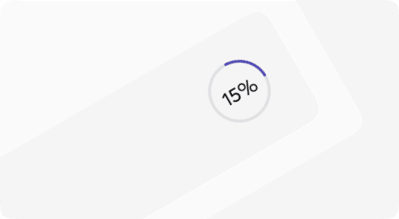
CircularProgress
A progress indicator (Circular and Linear) is a visual representation of a user’s progress through a set of steps, guiding toward the completion of a specified process.

Combobox
An input that behaves similarly to a select, with the addition of a free text input to filter options. Based on [Headless U](https://headlessui.com/).
Drawer
The Drawer component is a panel that slides out from the edge of the screen. It can be useful when you need users to complete a task or view some details without leaving the current page. Based on [Headless UI](https://headlessui.com/).
Dropdown
An option that's been selected can represent a corresponding value in forms or be used to filter/sort content. Based on [Headless UI](https://headlessui.com/).
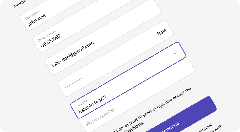
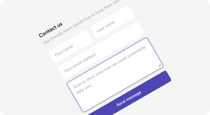
Form
Form component is a grouping of input controls that allow a user to submit information to a server. You can set the size prop for Form and this size will be applied to all children's components. You can set disabled and error props prop for Form.Item and this props will be applied to all children's.
Group
Combine different types of inputs into groups to save vertical space on your designs and also simplify form filling.
IconButton
Buttons allow users to take actions, and make choices, with a single tap. Buttons communicate actions that users can take. They are typically placed throughout your UI, in places like: - Modal windows - Forms - Cards - Toolbars
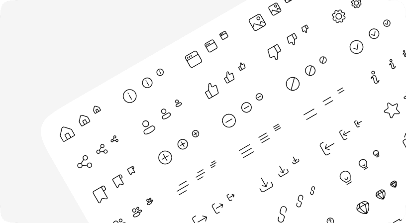
Icons
Moon Design System provides a set of commonly used interface `icons` you can use in your project. To use the icons, install the npm package: `@heathmont/moon-icons-tw`.
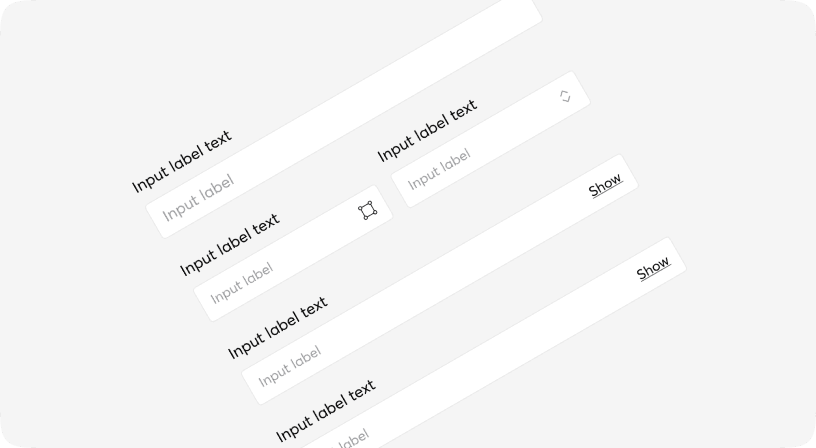
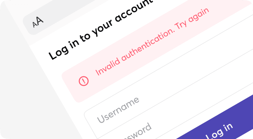
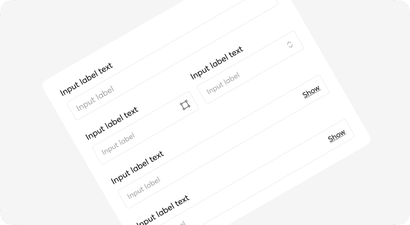
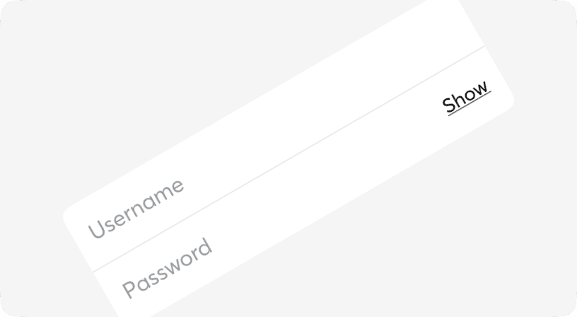
Input
Text input fields allow users to enter text and can be used to collect user feedback or enter information in data entry forms. These types of input fields are used on their own, or in combination with other inputs such as number entry, date picker, etc.
InsetInput
Text input fields allow users to enter text and can be used to collect user feedback or enter information in data entry forms. These types of input fields are used on their own, or in combination with other inputs such as number entry, date picker, etc.

InsetNativeSelect
A form input utilized to select a value: when collapsed, it displays the presently chosen option, and when expanded, it reveals a scrollable list using native select of browser for the user to make a selection. When in a collapsed state, it displays the presently selected option, and upon expansion, it presents a scrollable list of predefined choices for the user to select from. Moon.io offers two types of selects: one that opens the browser's native styling option list and a [Dropdown](https://moon.io/core/dropdown).
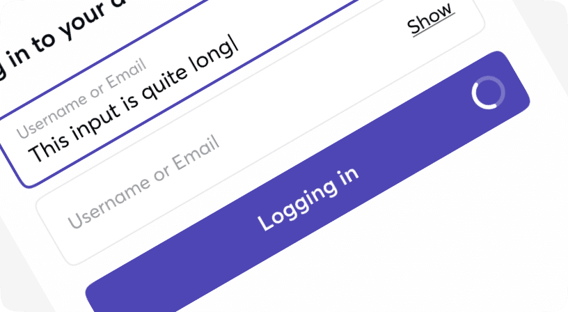
Loader
Loaders provide a visual cue that an action is processing awaiting a course of change or a result.
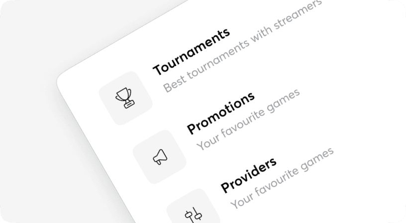
MenuItem
Menu items are used in such vertical menu and containers as Popovers, Sidebars, Drawers, Dialogs etc. Menu item row heights can vary based on the amount of content in each row. The content in each row is flexible. By default, each menu item row height is Medium(md) 40px for one line of content.
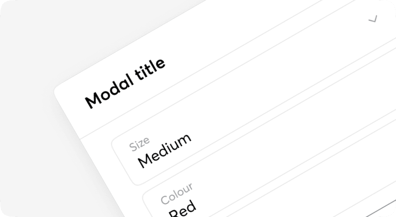
Modal
A modal is an interface element that appears over other content. It requires an interaction from the user before they can return to whatever is underneath. Based on [Headless UI](https://headlessui.com/).
NativeSelect
A form input designed for value selection: in its collapsed state, it reveals the presently chosen option, and upon expansion, it presents a scrollable list of predetermined choices for the user's selection. In a collapsed state, it reveals the currently selected option, and upon expansion, it displays a scrollable list of predefined choices for the user's selection. Moon.io supports two types of selects: one that opens the browser's native styling option list and a [Dropdown](https://moon.io/components/dropdown).
Pagination
Pagination is the process of splitting information over multiple pages instead of showing it all on a single page. Also the name for the interface component used for navigating between these pages.
Popover
Popovers are perfect for floating panels with arbitrary content like navigation menus, mobile menus and flyout menus. Based on [Headless UI](https://headlessui.com/).
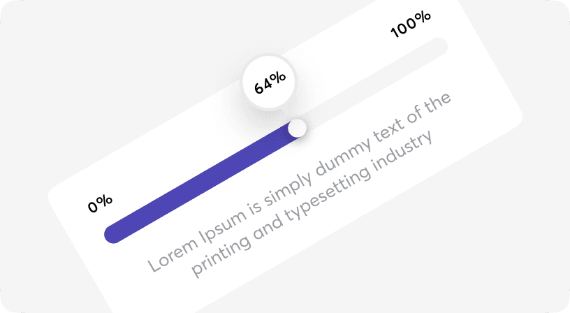
Progress
A progress indicator (Circular and Linear) is a visual representation of a user’s progress through a set of steps, guiding toward the completion of a specified process.
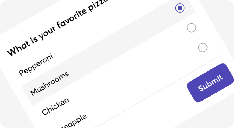
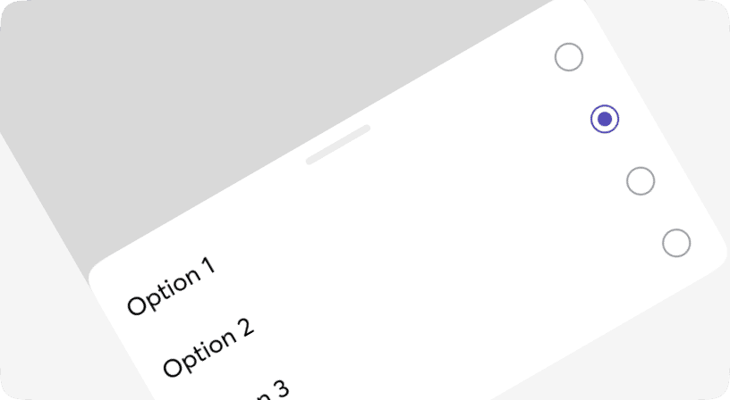
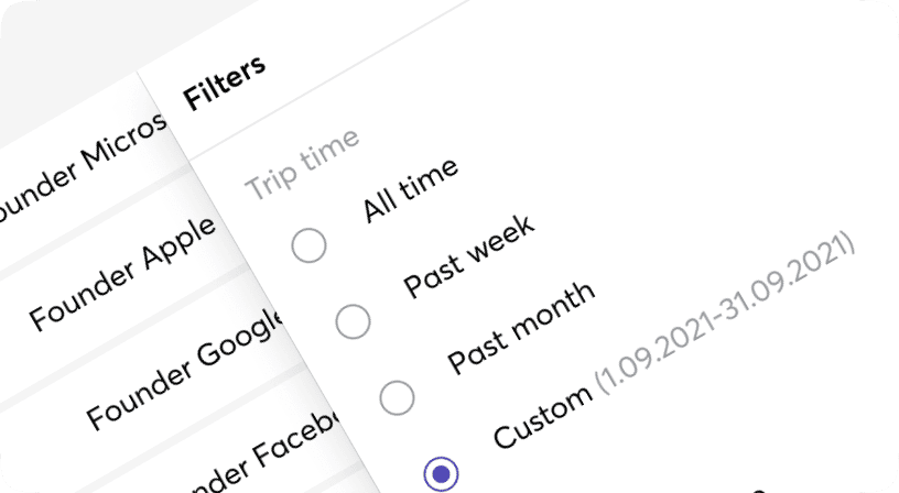
Radio
Radio buttons are used to represent a group of choices whereby users can only select one option. The main difference between the radio button and the checkbox is, users are allowed to select single options whereas in the checkbox you can have multiple options. Based on [Headless UI](https://headlessui.com/).

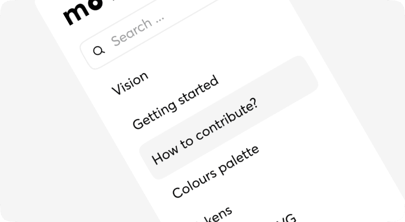
Search
Search enables users to specify a word or a phrase to find relevant pieces of content without the use of navigation.
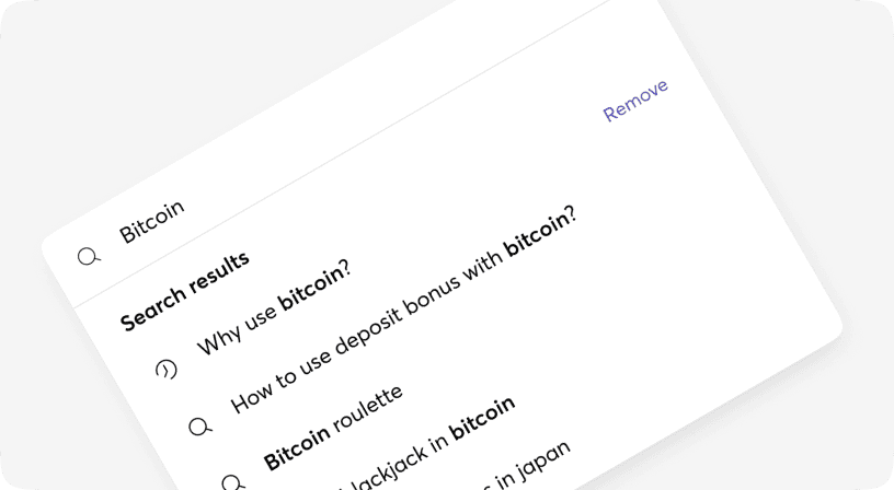
SearchCmdk
Command menu search can be used as an accessible combobox. You can render items, and it will automatically filter and sort them.
Snackbar
The snackbar component is a non-disruptive message that appears on the interface to provide quick, at-a-glance feedback on the outcome of an action. Based on [Radix](https://www.radix-ui.com/).
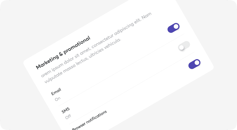
Switch
Switch is a control that is used to quickly switch between two possible states. Switches are only used for these binary actions that occur immediately after the user “flips” the switch. They are commonly used for “on/off” switches. Based on [Headless UI](https://headlessui.com/).
Table
A component for displaying large amounts of data in rows and columns. Based on [TanStack Table v8](https://github.com/TanStack/table).
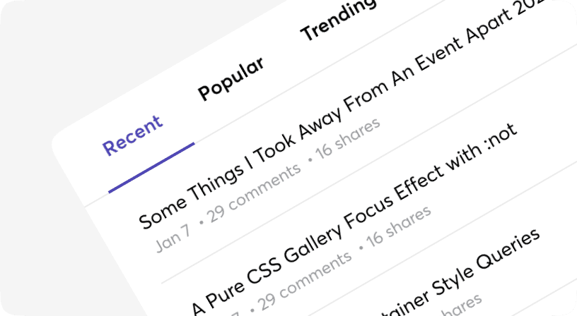
Tabs
Tabs to allow users to navigate easily between views within the same context. Each tab should contain content that is distinct from other tabs in a set for example, tabs can present different sections of news, different genres of music, or different themes of documents. Based on [Headless UI](https://headlessui.com).

Tag
Tags represent a set of interactive keywords that help organize and categorize objects. Tags can be added or removed from an object.
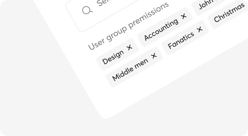
TagsInput
TagsInput is an extension of the text input fields. This component allows users to both enter text and capture input results and display them as well. These selected text entries are being displayed as tags. Tags represent a set of interactive keywords that help organize and categorize objects. Tags can be added by pressing the <kbd className="inline-block whitespace-nowrap rounded px-1.5 font-medium tracking-wide text-moon-14 border border-beerus text-trunks ms-auto">Enter ⏎</kbd> key or removed by the mouse click from the input element.
Textarea
A form control for editing multi-line text.
Tooltip
A method of presenting a text or supplementary description regarding an element, typically upon hovering, yet alternatively upon click or tap. Based on [Radix](https://www.radix-ui.com/).